We could not believe this..
A lesson in printing colors
Getting the colors right for our polos has been an incredibly tedious and frustrating experience. And mind you, we were working with a company, with loads of experience in printing and embroidery. They work with some of the most high end fashion and boutique brands out there.
Most of the colors from our palette were fine, but the one color, one of our main brand colors, was somehow very hard to achieve. We're talking about the color rust. The first time we got our printing samples in to check the color, it was something between an electric orange and fiery red.
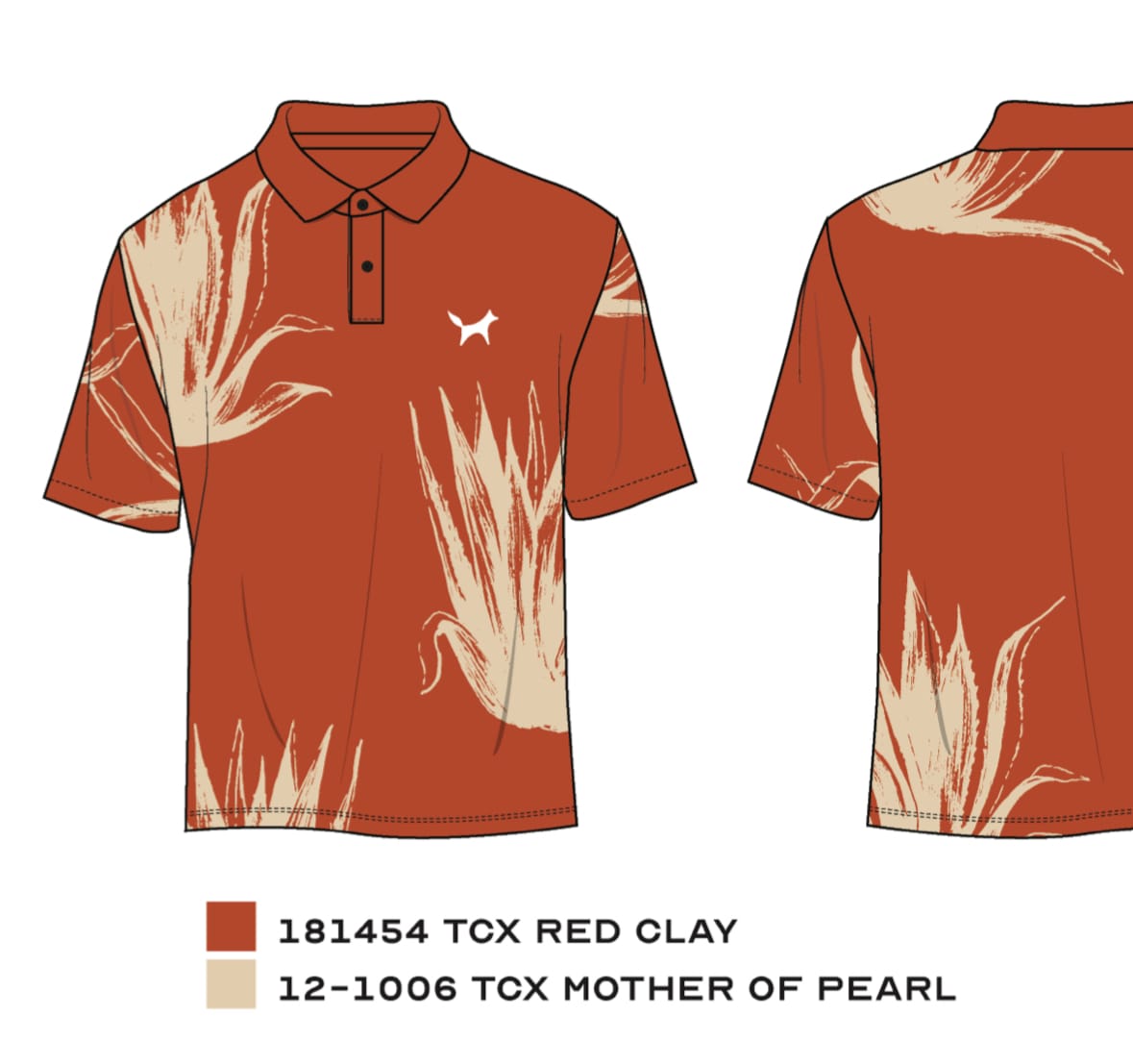
Here's our digital file, with pantone colors provided:
And here's what we got back from the factory:
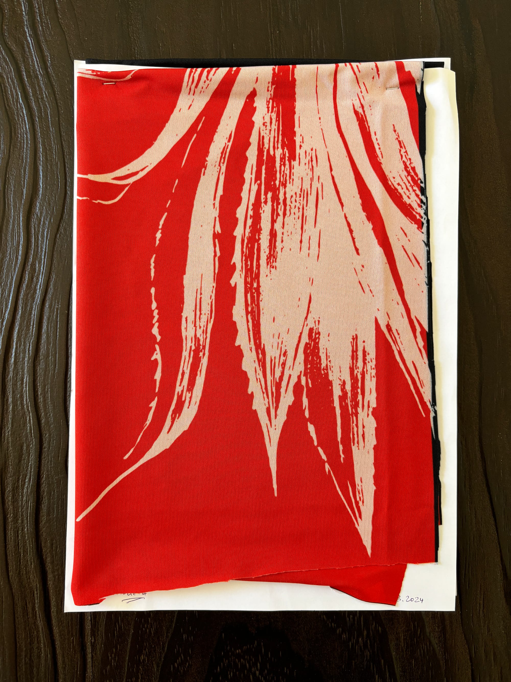
Understand that each screen is vastly different in displaying colors, so these results may not seem as shocking to you. But that was literally the mistake that had been made, using a digital screen to judge the hue and saturation of a color. One of the designers at the production facility, had just looked at the color on his screen and then proceeded to replicate that in production (rather than using the Pantone color provided).
When we heard this, we were gobsmacked. While it must have looked pretty red on his screen, if you work in the printing and design business, you should never go off the color that you see on your screen. That, my friends, is why the whole fashion & design industry rely on the Pantone institute, to have consistent colors across the board. This designer actually had years of experience, though this seemed like a rookie mistake.
On a visit to the factory up in the north of Portugal, they explained that Pantone colors wasn't really usable in this case, since the material we were using reacts very differently to the colors of the printer. They did have a large sheet with a bunch of test colors on it, which they were happy to lend us.
Using this large sheet, we picked the color we believed was closest to the digital counterpart. We ended up picking "13-5-1 C" which can be seen in the image below. Right next to the following sample we received a couple of weeks later.
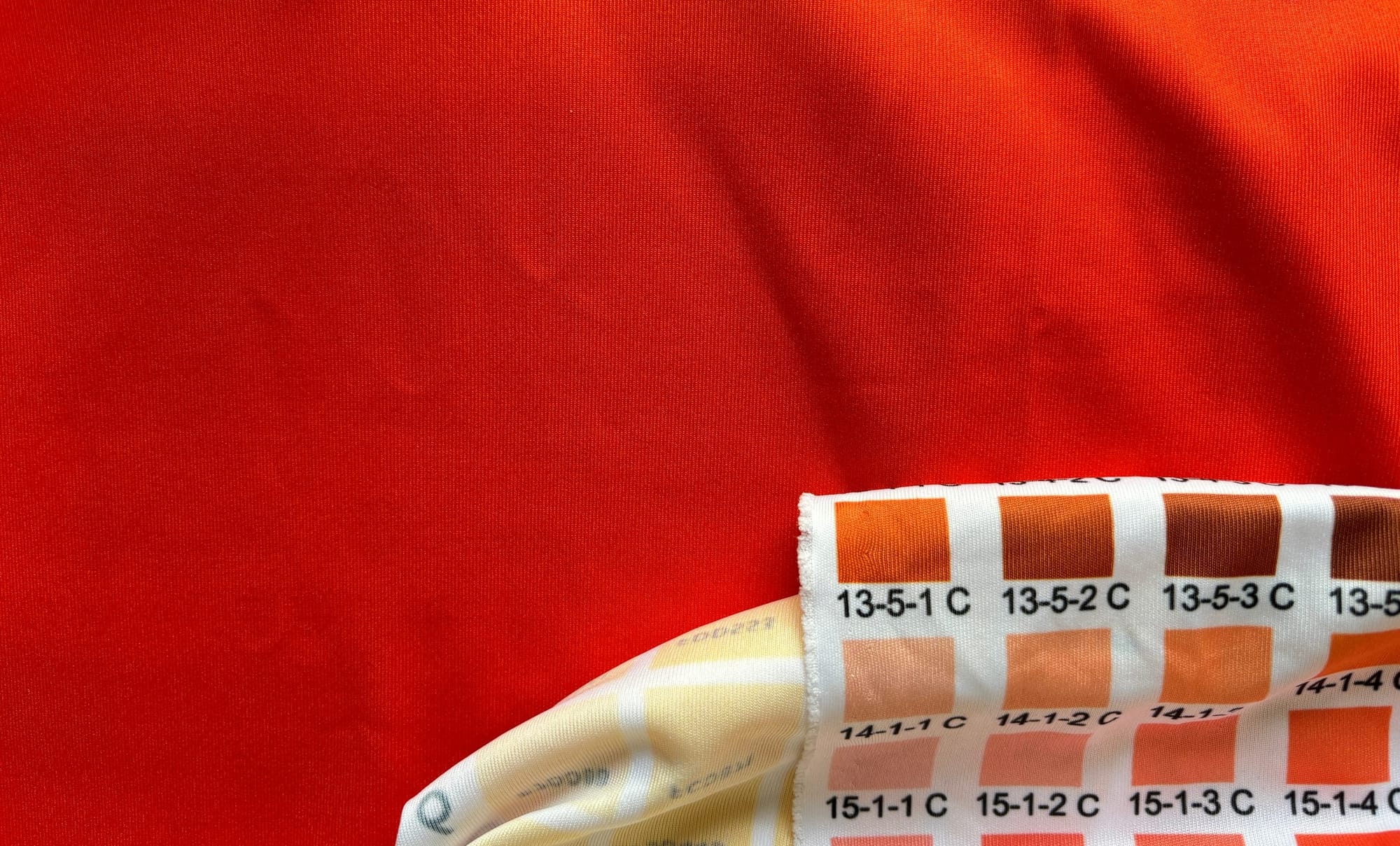
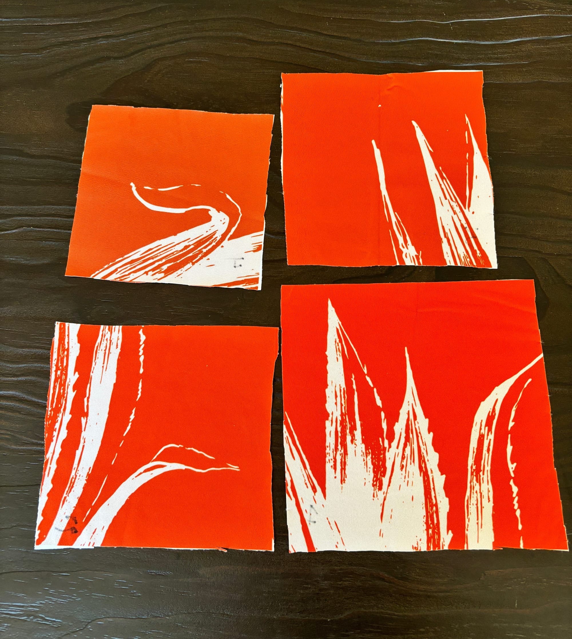
Again, they did not manage to get the color right, even going off their own reference material, getting the color we wanted proved to be a complicated matter. It also is the reason why getting samples is so important. You can have a vision, or some digital designs, but you never truly know how things will turn out until you receive them from the manufacturer.
Communication also seemed hard, so we ended up clarifying the situation with our agent up north, and they finally were able to get the message through to the printer. The next samples we received were all a lot better, and one was even good enough to sign off on.
This means we are once again moving forward with production. The initial timeline we were given was end of January, but seeing as it's already the start of February, that did not happen. We now expect to have the production order ready end of March.